Layers of Meaning: Kaatje Vermeire's Innovative Illustrations


Every month we blog about an illustrator that we love, giving you the opportunity to learn more about your favourite authors' background and influences, or to discover great picture books you may not have heard of. Last month we wrote about the Dutch creator of Miffy, Dick Bruna. This time we’re keeping it continental with a strikingly original contemporary illustrator from Belgium, Kaatje Vermeire.
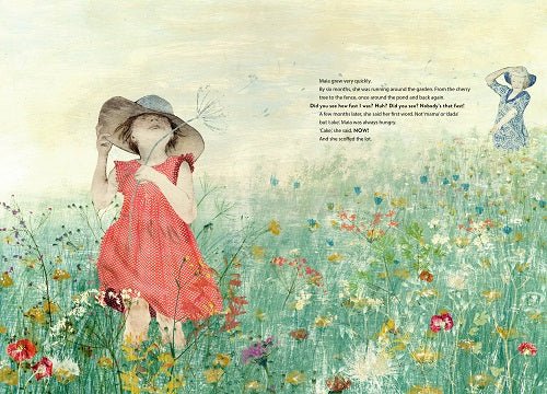
Vermeire is the illustrator of two of our most popular books in the shop, Maia and What Matters, written by Tine Mortier, and The Big Question, written by Leen van den Berg, (both have been translated to English by David Colmer). Her illustrations for Maia and What Matters won Vermeire the Grand Prize at the Picturale Competition in Ronse in 2010, and the book has been translated into more than a dozen languages.
Experiments
Kaatje Vermeire wanted to create things ever since she was a child. Her artistic experimentation was encouraged by her parents, and after finishing school she attended the Academy of Fine Arts in Ghent; first studying Graphic Design and Advertising, and then Graphic Arts. Moving from the structured, technique based field of graphic design, to the more free and creative practise of Graphic Art, gave Vermeire the magic combination of skill, discipline and creativity needed to create her unique books. When she showed her graduation project to a visiting lecturer, the illustrator Carll Cneut, he encouraged Vermeire to contact an author and publishing house, who had enough faith in her to create a new book based around her illustrations. This was how she fell into children’s book illustration, and she has continued creating books since then.
It was through her studies in graphic design that Vermeire discovered and experimented with different printmaking methods like woodcuts and etchings. She now works in a variety of mediums, and through experimenting with manual techniques Vermeire is able to create her own visual vocabulary.
Layers of meaning
In an interview for playingbythebook.net, Vermeire talked about how the physical process of her work has developed since leaving college. For her first book, she created each illustration fully by hand, printing layers upon layers on a single sheet. But she soon discovered a flaw in this process when she had to start from scratch if there was even a tiny mistake in just one of the layers! Vermeire now etches each element of an illustration separately, and then inputs the prints into her computer to assemble and edit digitally. (Read how another of our favourite contemporary illustrators, Chris Haughton, also combines digital and handmade illustration in one of our previous blogs.)
Vermeire speaks in this interview about the narrative aspect of this layering technique, and how the process helps her to add layers of meaning to every book she works on;
“I try to suggest/evoke worlds different from those that are described in the texts. By adding little details, inventing new characters that aren’t present in the text, including humour now and then, I want to create an atmosphere full of little channels to escape into… For children as well as for adults. Lightness on the surface, but deepness behind… If you take a good look.”
Symbolism
In all of the books Vermeire has worked on, every one of her illustrations contains its very own narrative, which compliments the story's text. In her prizewinning illustrations for Maia and What Matters, she uses symbols and composition to tell us more about the relationship between Maia and her grandmother. Vermeire’s illustrations change tone midway through the book, illustrating how this relationship changes when the grandmother has a stroke, rendering her unable to speak.

In the above image Vermeire presents us with a wall of uniformed, faceless nurses, who tower above the vulnerable Maia, and her grandmother. The decision to draw Maia barefoot reminds us of her childlike innocence, and the carefree days she spent in the garden with her grandmother before she fell ill.
Playing with form
Vermeire is quoted on her website as saying “I am inclined to think that my illustrations can only be good if blood, sweat and tears have preceded. While a free, rough and spontaneous sketch can sometimes be so much more powerful… and can come to the essence so much more.” Although she manipulates her images digitally before submitting them for publishing, Vermeire’s work is still predominantly handmade and based on paper. For her, the physical act of illustrating is a process of play and experimentation. She uses objects to create extra depth and texture, and can be impulsive with what she adds to a composition.
In the above illustration, Maia is cast adrift with her grandmother in a stormy sea. A squirrel holds out an unplugged phone, and the letters of words Maia’s grandmother has lost float around it in the water. All of the symbols in this illustration tell us that Maia misses being able to have a conversation with her grandmother. In allowing herself to be spontaneous with what is added to the page, Vermeire may be able access a more unconscious way of expressing things than if she were to sit down and think about the symbols she uses.
Books for grown up children
One of our most popular book choices in Tales for Tadpoles, especially for adults buying for adults, is The Big Question. Illustrated by Kaatje Vermeire and written by Leen van den Berg, The Big Question was published in 2014. The book is a thoughtful meditation on the meaning of love. In it, a troupe of animals and people call a meeting to discuss the ultimate big question: “how do you know when you love someone?”
Everyone has a different answer to this question, and some of the creature’s responses are very touching. But it all leaves the chairperson of the committee, a small ant, feeling rather lonely. It’s hard to imagine anyone else having illustrated this book, the complexity of The Big Question lends itself perfectly to Vermeire’s style. Her method of printing a series of images individually to create a combined whole reminds us that, although you can love another person entirely, ultimately it’s up to every individual to decide what love means to them.

Vermeire is adept at creating an atmosphere with colours, and throughout the book she paints a striking contrast between the rose pinks and spring greens of love, and the deep blues of loneliness. This illustrator's work is equally at home in a picture book or a fine art gallery.
A new outlook
Kaatje Vermeire is just one of the great illustrators currently working on the continent, who are strangely underappreciated by English speaking audiences. Although many of her books have been translated, readers in Ireland and the UK tend to stick to what they know and miss out on the experimental, innovative approaches being taken by continental illustrators like Vermeire and Beatrice Alemagna, among others. Treat yourself to a new outlook by picking up one of Vermeire's books.
Browse the best in illustrated books, from experimental picture books to classic children’s literature, here. And see in store for a range of beautiful Kaatje Vermeire greeting cards.
Words by Sophie Meehan. Images kindly provided by Kaatje Vermeire's UK publisher, Book Island.


